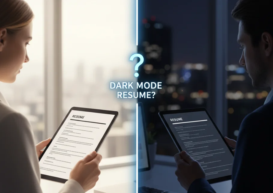
As digital consumption continues to evolve, dark mode has become a widely used feature across devices and applications. From smartphones to desktops, many users prefer dark mode for reduced eye strain and improved visual comfort. This shift raises an important question for job seekers: should resumes also be designed specifically for dark mode viewing. While it may seem like a modern and innovative approach, the reality of recruitment systems and resume screening processes requires careful consideration before adopting such a design strategy.
What Is Dark Mode and Why It Matters
Definition of Dark Mode
Dark mode is a display setting that uses a dark background with light colored text. It is commonly used in applications, operating systems, and browsers to enhance readability in low light conditions and reduce eye fatigue.
Growing Usage Trends
The popularity of dark mode has increased significantly as more platforms offer this option. Many professionals use dark mode while working on devices for extended periods. This trend has influenced design considerations across digital content.
How Resumes Interact With Dark Mode
Impact of File Formats
Most resumes are shared as PDF or document files. These formats are typically fixed in design, meaning that they do not automatically adapt to dark mode settings. Unlike websites or apps, resumes do not dynamically change colors based on user preferences.
Viewer and Device Settings
Some applications may invert colors or adjust display settings when dark mode is enabled. However, this behavior is not consistent across devices and software. As a result, a resume designed specifically for dark mode may not appear as intended for all viewers.
Pros and Cons of Designing for Dark Mode
Advantages
Designing for dark mode can create a modern and visually distinct appearance. It may stand out in certain creative fields where design innovation is appreciated. Dark backgrounds can also reduce glare and improve readability in specific conditions.
Limitations
There are significant limitations to dark mode resume design. Many applicant tracking systems may not process such designs effectively. Printing a dark themed resume can also lead to poor readability and high ink usage. Additionally, inconsistent rendering across devices can create a negative impression.
Best Approach for Resume Design
Use Neutral and Flexible Design
A neutral design approach works best for resumes. Using a light background with dark text ensures compatibility across different devices, systems, and formats. This approach maintains readability in both digital and printed versions.
Ensure Proper Contrast
High contrast between text and background is essential for readability. Clear contrast improves scanning and ensures that important information is easily visible to recruiters.
Keep Layout Simple
Simple layouts with clear sections and minimal design elements are more effective. They improve compatibility with digital systems and make it easier for recruiters to review content quickly.
Impact on Applicant Tracking Systems
Applicant tracking systems are designed to extract and process text from resumes. Complex designs, unusual color schemes, or heavy formatting can interfere with parsing accuracy. Dark mode designs may introduce challenges in text recognition and data extraction, reducing the effectiveness of the resume in automated systems.
Common Mistakes to Avoid
One common mistake is prioritizing visual design over readability. Using dark backgrounds with low contrast text can make content difficult to read. Another issue is assuming that all viewers will see the resume in the same way. Ignoring compatibility with applicant tracking systems and printing requirements can also reduce effectiveness.
Future Outlook of Resume Design
As technology evolves, resume formats may become more adaptive and responsive. Future systems could support dynamic display modes that adjust based on user preferences. However, current hiring practices still rely heavily on fixed format documents, making traditional design approaches more practical.
Conclusion
Designing a resume specifically for dark mode is not necessary and may create more challenges than benefits. While dark mode is popular in digital environments, resumes must remain compatible with a wide range of systems, devices, and formats. A clean, simple, and high contrast design ensures readability and effectiveness in both digital and printed formats. Job seekers should focus on clarity and functionality rather than trends, ensuring that their resume performs well in real world hiring scenarios.