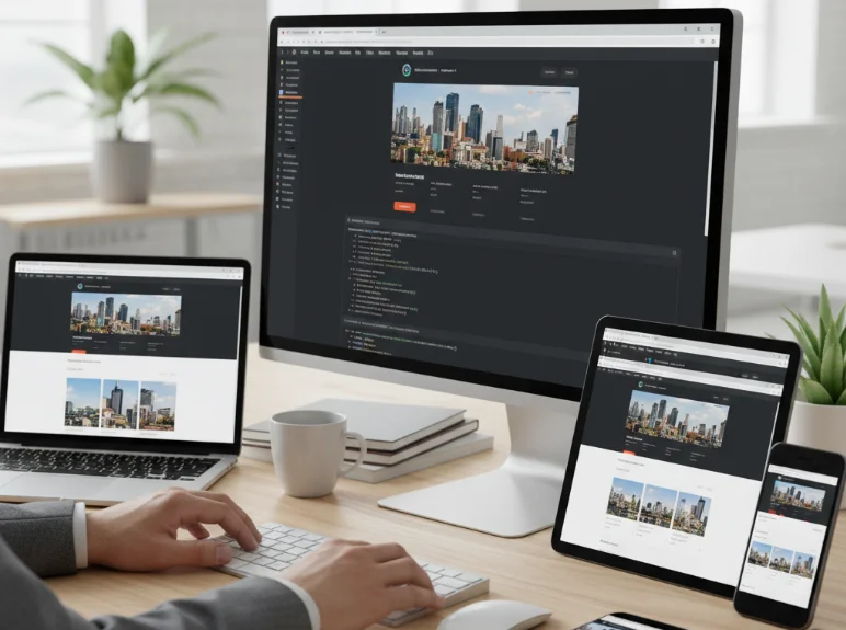
Creating websites that look and function well across all devices is no longer optional—it’s essential. Users access websites from a variety of screens, from mobile phones to large desktop monitors. My approach to building responsive websites emphasizes adaptability, performance, and user experience while maintaining clean and maintainable code.
Understanding Responsive Design
Responsive design ensures that websites automatically adjust their layout and elements based on the device’s screen size and orientation.
- It prioritizes flexibility, scalability, and usability.
- Responsive websites reduce the need for separate mobile or desktop versions, simplifying maintenance.
- Key goals include readability, navigability, and accessibility across all devices.
Mobile-First Approach
I usually start designing websites with mobile users in mind, then progressively enhance the layout for larger screens.
- Mobile-first ensures core content and functionality are prioritized.
- It prevents bloated layouts that work on desktops but break on smaller screens.
- CSS is written starting from the smallest viewport, then media queries are used to adapt for tablets and desktops.
Flexible Layouts and Grids
Using flexible layouts and grid systems allows websites to adjust seamlessly to varying screen sizes.
- CSS Flexbox is my go-to for one-dimensional layouts like navigation bars or card lists.
- CSS Grid is ideal for two-dimensional layouts, giving precise control over rows and columns.
- Relative units like percentages or viewport widths make elements scale naturally instead of using fixed pixel values.
Media Queries and Breakpoints
Media queries are a fundamental tool for responsive design, allowing styles to change at specific viewport widths.
- I define breakpoints based on the content and layout rather than device specifications, creating a fluid experience for all screens.
- Common breakpoints include mobile (< 768px), tablet (768–1024px), and desktop (> 1024px).
- Media queries enable adjustments for font sizes, padding, margins, and element positioning to improve usability.
Fluid Images and Media
Media such as images, videos, and SVGs must scale properly to avoid overflow or distortion.
- Use relative units or the
max-width: 100%CSS rule to make images scale with their containers. - Consider using the
pictureelement orsrcsetfor serving different image sizes to different devices. - Videos and iframes are embedded responsively to maintain aspect ratio on all screens.
Testing on Multiple Devices
Testing is crucial to ensure a responsive website works across various screen sizes and resolutions.
- I use browser developer tools to simulate different devices and orientations.
- Testing on real devices helps catch issues that emulators may miss, such as touch interactions or performance quirks.
- Regular testing during development prevents last-minute layout fixes before launch.
Accessibility and Performance
Responsive design is closely linked to accessibility and website performance.
- Text should remain readable, buttons tappable, and navigation intuitive regardless of screen size.
- Optimizing images, compressing assets, and minimizing unnecessary scripts ensures fast loading on mobile networks.
- Accessible design also considers color contrast, font sizes, and keyboard navigation.
Final Thoughts
Building responsive websites requires a balance of design sensibility, technical skill, and thorough testing. My approach emphasizes a mobile-first mindset, flexible layouts, fluid media, carefully chosen breakpoints, and continuous testing. By prioritizing accessibility, usability, and performance, responsive websites provide a consistent, engaging experience for all users, regardless of device or screen size.