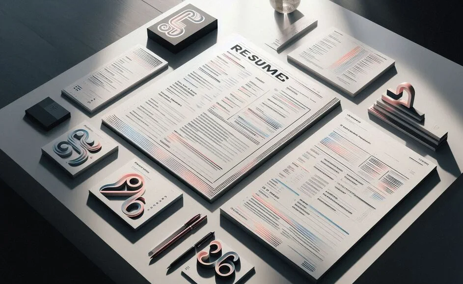
As we approach 2026, the world of resume design continues to evolve, with typography playing a crucial role in shaping how job seekers present their professional profiles. In a competitive job market, having a resume that stands out visually is just as important as the content it holds. Typography is one of the key elements that can elevate a resume, making it not only aesthetically pleasing but also easier to read and more professional. In this blog post, we will explore the latest typography trends that will dominate resume design in 2026 and how you can leverage these trends to create a modern, stylish, and effective resume.
Introduction
Typography is a cornerstone of visual communication. Whether it's for print, digital media, or resumes, the fonts, spacing, and layout you choose can greatly influence how your message is perceived. In the context of resumes, typography doesn’t just make your document look attractive it plays a pivotal role in readability, hierarchy, and overall user experience. As we look ahead to 2026, certain typography trends are emerging that will redefine how resumes are designed. By understanding these trends, you can ensure your resume not only catches the eye of hiring managers but also communicates your professionalism in the most effective way possible.
Why Typography Matters in Resume Design
Typography is more than just choosing a pretty font. It directly impacts the readability, tone, and professionalism of your resume. A well-designed resume with the right typography will:
- Enhance readability: Clear fonts and appropriate spacing make it easier for hiring managers to scan your resume quickly, which is crucial when they’re reviewing dozens or even hundreds of applications.
- Establish a professional tone: The typography you choose reflects your personal brand. Modern, clean fonts suggest you are up-to-date and in touch with current design trends.
- Improve hierarchy: Using different font sizes, weights, and styles helps create a visual hierarchy, guiding the reader’s eye to the most important information.
Top Typography Trends for Resumes in 2026
As we look ahead, several typography trends are expected to shape the way resumes are designed in 2026. Let’s explore the top trends that will make your resume stand out in 2026.
Modern Sans-Serif Fonts
One of the biggest trends for 2026 resumes is the continued popularity of clean, modern sans-serif fonts. These fonts are simple, contemporary, and easy to read, which makes them ideal for resume design. Examples of popular sans-serif fonts include:
- Helvetica Neue
- Roboto
- Montserrat
- Open Sans
These fonts are highly versatile, offering a professional, minimalist look that complements the clean and clutter-free design aesthetic that is dominating resume trends. They are perfect for resumes that need to be readable and visually appealing without the distraction of ornate serifs.
Minimalist Typography
As we move into 2026, minimalist design continues to be a driving force in many creative industries. The same applies to resumes. Minimalism in typography involves using simple, straightforward fonts with ample white space to create a clean, uncluttered look. This approach helps to focus attention on the most important aspects of your resume while ensuring that it doesn’t overwhelm the reader with excessive text or complex fonts. Keep your design simple and allow your content to shine.
Custom and Unique Fonts
While modern sans-serif fonts dominate, another emerging trend for 2026 is the use of custom and unique fonts. These fonts help create a personal and memorable brand identity. For instance, creative professionals like graphic designers or marketing experts may choose to use custom typefaces that align with their personal brand or the industry they’re applying to. However, it’s important to use custom fonts sparingly and ensure they maintain readability, especially in more formal or conservative industries.
Best Practices for Using Typography in Resumes
Choosing the right fonts is only one part of the equation. To make the most of typography in your resume, it’s essential to follow best practices that enhance readability, create a clear structure, and avoid design pitfalls.
Prioritize Readability
The most important factor in any resume design is readability. Choose fonts that are legible at various sizes, particularly when printed out. Avoid overly decorative or hard-to-read fonts, especially in the body text of your resume. Use bold or italic styles sparingly to emphasize key points, but do not overdo it, as this can reduce readability.
Font Size and Hierarchy
Font size is critical to creating a clear visual hierarchy. Use larger font sizes for headings and section titles (e.g., 16-18px), and smaller sizes for the body text (e.g., 10-12px). This ensures that important information stands out, while still keeping the document neat and well-organized. Consistent font sizing helps the reader quickly navigate the resume.
Using Contrast Effectively
Contrast is another key element in typography. A high contrast between the text color and background color (typically black text on a white or light background) ensures that your resume is easy to read. You can also use contrasting font weights (e.g., bold for headings and regular for body text) to draw attention to the most important sections.
Conclusion
Typography plays a crucial role in the design of resumes, and as we approach 2026, the trends in this area are evolving to meet the demands of a more digital and visually sophisticated world. By embracing modern sans-serif fonts, minimalist designs, and the strategic use of custom fonts, you can create a resume that not only looks great but is also easy to read and engaging. Remember, the key to effective typography in resume design is balance keeping it professional, readable, and visually appealing. By following these typography trends and best practices, you can craft a resume that helps you stand out in a competitive job market in 2026.