When it comes to designing a resume, the content is paramount, but how that content is presented visually also plays a key role. While dividers, shapes, and visual anchors can help organize your resume and make it easier to scan, they can also become distractions if used incorrectly. In this post, we'll dive into how you can use these visual elements effectively to support your resume's content without detracting from it.
Why Use Visual Elements in Resume Design?
Visual elements such as dividers, shapes, and other graphical components can enhance your resume’s layout, guiding the reader’s attention where it’s needed most. However, as with all design, these elements must be used judiciously. In this section, we’ll explore why visual elements are important and how they improve the resume reading experience.
Importance of Visual Elements
Incorporating visual elements into your resume makes it easier for a recruiter to navigate the document quickly. Rather than reading through long paragraphs, they can visually scan key sections such as your name, job experience, skills, and contact information. A clean, organized layout with visual elements helps recruiters find what they need fast, which is crucial in a high-volume hiring environment. A well-designed resume demonstrates that you have an eye for detail and understand the importance of structure and organization.
How Visual Elements Improve Readability
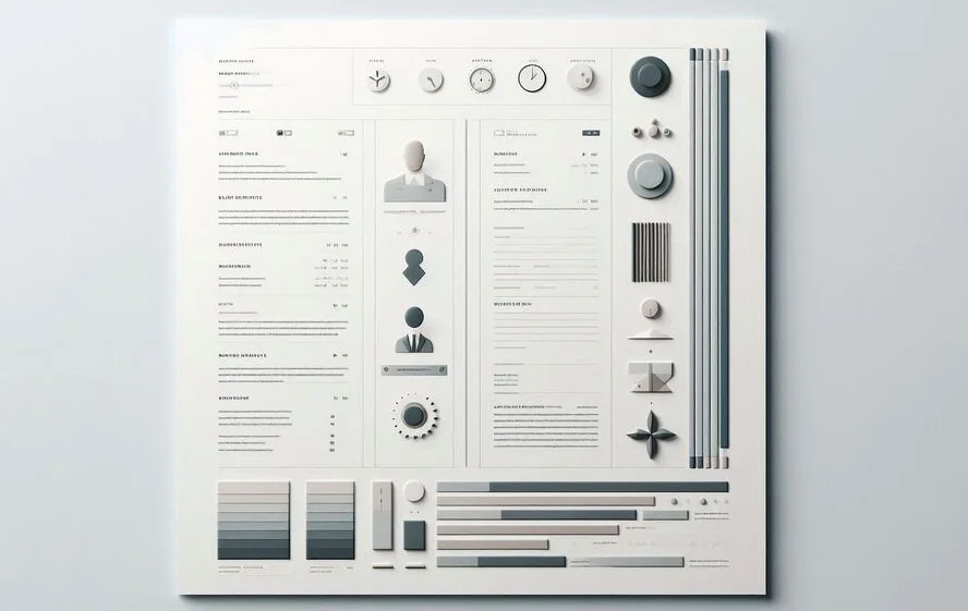
By dividing your resume into clear sections with the help of dividers and shapes, you ensure that the content is broken into digestible chunks. Horizontal lines can separate sections like education and experience, making it easier for recruiters to follow. Visual anchors, such as subtle icons or lines, can guide the reader’s eye towards the most critical details, allowing them to skim through your resume without missing important information.
The Impact of Excessive Design Elements
While it’s important to use visual elements, too many can actually hurt the design of your resume. Overuse of flashy graphics, bold dividers, or unnecessary shapes can overwhelm the content and make the document appear cluttered. In this section, we’ll explore how excessive design can backfire and distract recruiters from the key information.
Distracting Design Elements
Design elements should never overpower the content. Flashy borders, bold patterns, or heavy use of color can create visual noise. These distractions make it difficult for a recruiter to quickly process the information they need. Remember that a resume is meant to showcase your qualifications, not your design skills. By using too many distracting design elements, you risk drawing attention away from your skills, experience, and education.
Cluttered Layouts and Recruiter Distraction
A cluttered layout can cause confusion, making it hard for recruiters to quickly find relevant information. If there are too many shapes or thick lines breaking up sections, the reader may struggle to focus on one area at a time. Instead of a streamlined process, they may feel overwhelmed and frustrated by trying to decipher the design, which may lead to them skipping over important sections.
Best Practices for Using Dividers and Shapes
In this section, we’ll share best practices for effectively incorporating dividers, shapes, and other visual elements into your resume design without detracting from its professionalism.
Use Simplicity for Effectiveness
Simplicity is the key when using dividers and shapes. Use thin, light lines and basic geometric shapes to structure your resume. A clean, minimalistic design is always more professional than an overly complicated one. A simple horizontal line to separate your work experience from your education or a small, subtle icon for your contact information is often enough. Keep the design elements understated so they serve a purpose rather than drawing attention to themselves.
Ensure Functional Visual Anchors
Visual anchors like icons, lines, and dividers should always serve a functional purpose. For example, a small, simple icon next to each job title can help break up sections, making it easier for recruiters to scan your resume. Similarly, thin dividers can help separate sections without overwhelming the page. Avoid adding unnecessary design elements that do not aid the reader in navigating the document more efficiently.
Choose Subtle Shapes and Dividers
Subtlety is important when choosing shapes and dividers. Thick or colorful lines can easily become the focal point of the page, while thin lines in neutral colors (such as gray or black) will help divide sections without drawing too much attention. Choose simple shapes, such as squares or circles, to highlight specific sections like skills or achievements, but ensure they remain subtle and aligned with the overall design.
Avoid Overuse of Decorative Design
It’s tempting to add decorative elements like large icons, heavy borders, or elaborate fonts. However, these can quickly turn your resume into a visual overload. Instead, focus on functional design elements that guide the reader's eye naturally. The content should always take precedence, so avoid cluttering your resume with unnecessary embellishments.
Maintaining Balance in Design
Achieving balance between content and design is essential for creating a resume that is both professional and easy to read. In this section, we’ll discuss how to balance these two aspects without letting one overshadow the other.
Balance Between Content and Design
Content should always be the focal point of your resume. Use design elements to support the content, not to detract from it. Maintain a balanced layout where the text and the design elements complement each other. For example, use dividers sparingly and in a way that directs the reader’s attention to key areas like work experience, education, or skills. Don’t let the design overshadow the information—it should enhance the overall readability.
Proper Spacing and White Space
White space is your best friend when designing a resume. Adequate spacing between sections allows for a clean and organized layout. It also makes your resume easier to read, as recruiters aren’t overwhelmed by too much information crammed into a small space. Use margins, line spacing, and adequate padding around sections to create breathing room for the content. This will make your resume more aesthetically pleasing and easier for recruiters to scan.
Conclusion
Design elements such as dividers, shapes, and visual anchors can significantly enhance your resume if used thoughtfully. It’s essential to strike the right balance between design and content to ensure that your resume remains readable, professional, and effective. By following the best practices outlined above, you can create a resume that stands out for the right reasons and captures the attention of recruiters without being overwhelming or distracting.