Introduction
Alignment is a fundamental principle in design that influences how content is presented. It refers to the way elements on a page or screen are arranged in relation to one another. While alignment may seem like a simple aesthetic choice, it can have profound effects on how we perceive professionalism, trustworthiness, and clarity. But does alignment subconsciously signal professionalism, and how can it influence our perceptions in business settings? This blog explores the psychological impact of alignment and how it can shape our first impressions, perceptions of professionalism, and overall credibility.
Understanding Alignment in Design
Before we explore the psychological effects of alignment, it's important to understand what alignment means in the context of design. Alignment refers to the arrangement of elements in relation to each other on a page or screen. When done correctly, alignment creates a sense of order, structure, and balance. There are several different ways to achieve alignment in design, each of which has its own implications for the final look and feel.
Definition of Alignment
Alignment is the process of positioning elements so that they are visually connected to each other. This can be achieved through left alignment, right alignment, center alignment, or justified alignment. Each type of alignment gives a different aesthetic and functional outcome. The goal is to create a seamless flow of content that guides the viewer’s eye naturally from one element to the next. A well-aligned design feels organized and purposeful, while a poorly aligned design can feel chaotic and unstructured.
Types of Alignment
There are four primary types of alignment commonly used in design:
- Left Alignment: Aligns elements to the left margin. It is often used for text-heavy designs and is considered the most traditional form of alignment.
- Right Alignment: Aligns elements to the right margin. This alignment is often used for designs with short text or to create an asymmetrical effect.
- Center Alignment: Positions elements at the center of the page or container. This alignment is typically used for headlines, logos, or other focal points.
- Justified Alignment: Stretches text to fit the width of the page or container, creating straight edges on both sides. It is commonly used in newspapers and books.
Alignment and First Impressions
When it comes to design, first impressions matter. A well-aligned design communicates professionalism and competence, while poor alignment can create negative impressions of disorganization or carelessness. These first impressions are crucial, as they often happen within the first few seconds of encountering a new piece of content, whether it’s a website, a resume, or a marketing brochure. Subconsciously, we judge the quality and professionalism of the content based on its visual presentation, and alignment plays a significant role in this judgment.
Psychological Impact of Alignment
Alignment has a profound psychological effect on how we process and interpret information. When elements are well-aligned, they convey order and harmony, which can help users feel more at ease with the content. On the other hand, poorly aligned elements can create visual tension, leading to discomfort and confusion. Research in design psychology suggests that humans are naturally drawn to organized, symmetrical designs, as they are easier to process and more pleasing to the eye. This subconscious preference for order makes alignment a powerful tool in signaling professionalism.
Visual Harmony and Trust
When design elements are aligned, they create visual harmony that contributes to a sense of trust. This is particularly important in business settings, where trust is a key component of professionalism. A clean, well-aligned layout can inspire confidence in the viewer, signaling that the designer (or the business) is detail-oriented and reliable. In contrast, a poorly aligned design can create doubt and hesitation, making users question the credibility of the content or brand. In fact, studies have shown that people are more likely to trust and engage with content that is aesthetically organized and easy to navigate.
Alignment in Business and Professionalism
In business environments, the way you present yourself or your brand can significantly impact how others perceive your level of professionalism. This is particularly true for resumes, portfolios, and corporate branding. Alignment is one of the simplest yet most effective ways to signal professionalism and establish credibility. Whether you’re crafting a website or designing a business presentation, attention to alignment can make the difference between a polished, trustworthy appearance and one that feels rushed or unprofessional.
Alignment and Credibility
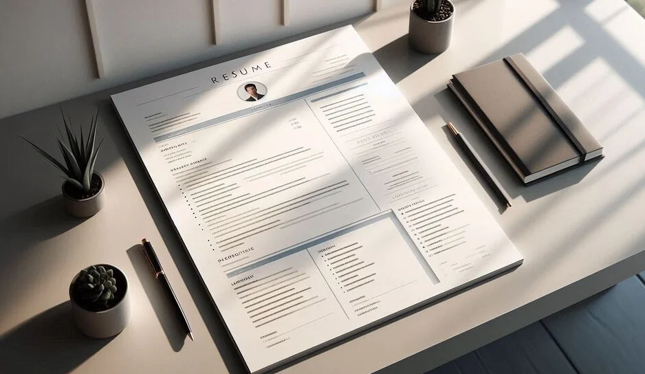
When elements are properly aligned, they enhance the credibility of your content. For instance, a resume that is carefully aligned with a consistent font size, clean margins, and evenly spaced sections looks polished and well-considered. In contrast, a resume with inconsistent alignment such as text that appears off-center or haphazardly placed can give the impression that the applicant is careless or unprofessional. Alignment, in this case, acts as a signal to the reader that the document has been thoughtfully crafted and that the individual pays attention to detail.
Alignment and Brand Identity
For businesses, alignment is an essential aspect of brand identity. Companies with a clear, consistent visual style achieved through proper alignment are perceived as more professional and reliable. Think about major brands like Apple or Microsoft: their websites and marketing materials always feature clean, consistent alignment that reinforces their brand’s professionalism. Misalignment, on the other hand, can undermine brand identity and make the company appear less credible. Aligning your content properly helps reinforce the message you want to communicate about your brand's values and quality.
How to Use Alignment to Signal Professionalism
To make the most of alignment in your designs, follow these best practices:
- Be Consistent: Consistency is key to maintaining professionalism. Make sure all elements follow the same alignment rules throughout the design.
- Use White Space Wisely: Don’t overcrowd your design. Proper alignment with adequate white space makes content more readable and aesthetically pleasing.
- Align to a Grid: A grid system is a helpful tool for maintaining consistent alignment throughout a design. Grids help you keep elements in balance and aligned properly.
- Balance Symmetry and Asymmetry: While symmetrical designs tend to feel stable and organized, sometimes strategic asymmetry can add visual interest. Just make sure it's purposeful and aligned.
Common Alignment Mistakes to Avoid
- Ignoring Consistency: Switching between different alignments throughout the design can create confusion and appear unprofessional.
- Poor Margin Spacing: Not paying attention to the margins can make your content look cramped and uncomfortable to read.
- Overcrowding Text: Don't overload the page with text in one area. This disrupts the alignment and can make the design feel unbalanced.
Conclusion
Alignment is a powerful tool in design, influencing everything from the clarity of content to the subconscious perception of professionalism. Whether you’re designing a website, crafting a resume, or creating a marketing brochure, paying attention to alignment signals attention to detail and reinforces credibility. It’s not just about aesthetics; it’s about creating a sense of order and reliability that makes users more likely to trust and engage with the content. By following the best practices for alignment, you can enhance the professionalism of your designs and leave a lasting, positive impression.