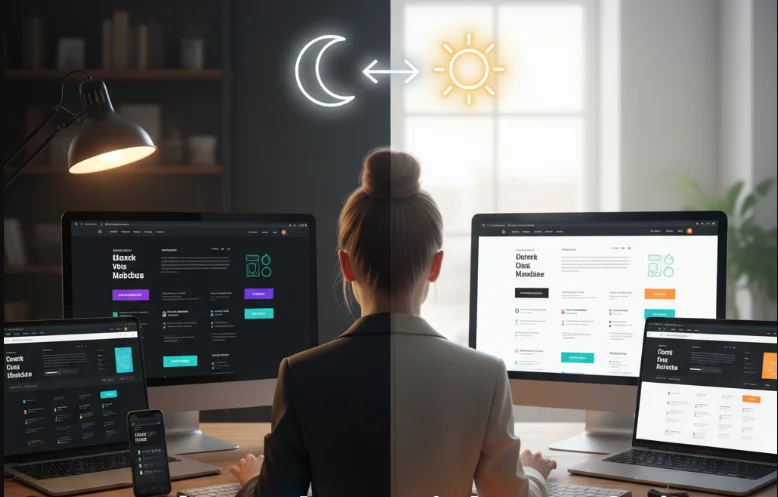
Dark mode and light mode have become standard design choices in modern web and app development. What used to be a simple aesthetic preference is now a key part of user experience design, affecting readability, comfort, accessibility, and even device battery life. As developers, choosing the right mode or supporting both is an important design decision.
In this post, I’ll break down the differences between dark mode and light mode, when to use each, and how I approach designing for both.
What Is Dark and Light Mode
Dark mode uses darker backgrounds with lighter text, while light mode uses light backgrounds with darker text.
- Light mode is the traditional web design approach, often using white or light gray backgrounds.
- Dark mode uses dark backgrounds such as black, navy, or deep gray with contrasting text.
- Modern systems and websites often allow users to switch between both modes dynamically.
User Experience Considerations
User preference plays a major role in deciding between dark and light mode.
- Some users prefer dark mode for low-light environments and reduced eye strain.
- Light mode is often perceived as more familiar and easier for reading long-form content.
- Offering both options improves accessibility and user satisfaction.
Accessibility and Readability
Good design must prioritize readability and accessibility in both modes.
- Proper contrast ratios are essential to ensure text is readable in both themes.
- Dark mode should avoid pure black backgrounds, as they can cause visual fatigue.
- Light mode should avoid overly bright whites that strain the eyes.
- Color choices must remain consistent and accessible in both themes.
Performance and Battery Impact
Dark mode can have practical benefits beyond aesthetics, especially on modern devices.
- On OLED and AMOLED screens, dark mode can reduce battery consumption.
- Light mode may consume slightly more power due to brighter pixels.
- Performance differences are generally small but noticeable in mobile usage.
Design Principles for Both Modes
Designing for both modes requires careful planning and consistency.
- Use design tokens or variables for colors to switch themes easily.
- Avoid relying on pure black or pure white for backgrounds.
- Ensure consistent spacing, typography, and layout across both modes.
- Test UI components in both themes to avoid contrast issues.
When to Use Dark Mode
Dark mode works best in specific contexts and applications.
- Applications used in low-light environments such as media players or developer tools.
- Dashboards and productivity apps where reduced glare is beneficial.
- Modern, visually rich interfaces where contrast can enhance focus on content.
When to Use Light Mode
Light mode remains the default for many websites for good reasons.
- Content-heavy websites like blogs, documentation, and news platforms.
- Interfaces designed for readability and long-form text consumption.
- Traditional business websites where clarity and familiarity are important.
Best Practice Approach
Instead of choosing one over the other, the modern approach is to support both modes.
- Detect system preferences using CSS media queries like prefers-color-scheme.
- Allow users to manually toggle between dark and light modes.
- Persist user preferences using local storage or cookies.
- Ensure both themes are equally polished and not treated as secondary.
Final Thoughts
Dark mode vs light mode is not about choosing a winner—it is about designing for flexibility and user comfort. Both modes have their strengths, and the best user experience comes from supporting both thoughtfully. As a developer, focusing on accessibility, contrast, and consistency ensures that your design works well in any environment and for any user preference.