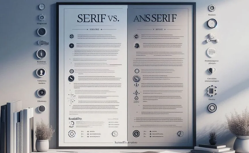
When it comes to designing a resume, one of the most crucial elements is font choice. Fonts not only impact the visual appeal of your resume but also its readability. Two main font categories dominate resume design: Serif and Sans-Serif. But which one is better for your resume? In this blog post, we’ll break down the science behind Serif vs. Sans-Serif fonts, explore their readability, and give you the insights you need to choose the right font for your resume.
Understanding Font Types
Fonts can be broadly categorized into two types: Serif and Sans-Serif. Each type has its own characteristics and applications. Understanding these font categories will help you make a more informed decision when designing your resume.
What Are Serif Fonts?
Serif fonts are characterized by small lines or decorative strokes that are added to the end of the main strokes of each letter. Some of the most popular Serif fonts include Times New Roman, Georgia, and Garamond. These fonts have been around for centuries, dating back to the early days of print. The small lines, known as “serifs,” were originally added to letters to help with readability in print.
What Are Sans-Serif Fonts?
Sans-Serif fonts, on the other hand, do not have the small lines or decorative strokes at the end of the characters. The term “sans” comes from the French word meaning “without,” which refers to the lack of serifs. Popular Sans-Serif fonts include Arial, Helvetica, and Calibri. Sans-Serif fonts are known for their clean, modern look, and are often used in digital design for their legibility on screens.
The Science of Readability
Font choice can significantly impact the readability of your resume. Readability, in turn, influences how easily a hiring manager or recruiter can process the information on your resume. So, let’s dive into the science behind how Serif and Sans-Serif fonts compare in terms of readability.
Serif vs. Sans-Serif: Which Is Easier to Read?
Numerous studies have been conducted to determine the readability of Serif versus Sans-Serif fonts. The general consensus is that Serif fonts are more legible in print, while Sans-Serif fonts are easier to read on digital screens.
Serif fonts are often preferred for printed materials because the serifs guide the reader’s eyes along the line of text, providing a smoother flow and helping with comprehension over longer reading periods. For this reason, Serifs are commonly used in books, newspapers, and formal documents.
However, Sans-Serif fonts have been shown to perform better on screens. The lack of serifs makes the text appear cleaner and crisper on digital displays. On a computer, smartphone, or tablet, Sans-Serif fonts reduce visual clutter, making it easier for the reader to distinguish individual letters and words.
Visual Implications of Serif and Sans-Serif
From a visual standpoint, Serif fonts tend to be more traditional and formal, which is why they’re often associated with printed publications and more formal settings. In contrast, Sans-Serif fonts offer a modern and sleek aesthetic, often used in more informal, contemporary designs.
Font Choice for Resumes
When it comes to choosing between Serif and Sans-Serif for a resume, there are several factors to consider. Your resume is not just a document; it’s your personal brand. The font you choose will have an impact on how you’re perceived by potential employers.
First Impressions Matter: Which Font to Choose?
Serif fonts, with their traditional appearance, might give off the impression of professionalism, formality, and seriousness. These fonts can work well if you are applying for a role in a more traditional or conservative industry, such as law, finance, or academia.
On the other hand, Sans-Serif fonts are often seen as more modern, approachable, and clean. These fonts may be better suited for industries like technology, design, or marketing, where a more contemporary and progressive image is desired.
Professionalism and Font Style
While Serif fonts are often considered more professional for printed documents, Sans-Serif fonts are no less professional when used appropriately. Both font types can communicate professionalism, but they do so in different ways. Serif fonts communicate a sense of tradition and credibility, while Sans-Serif fonts communicate clarity and modernity.
Tips for Choosing the Right Font for Your Resume
Choosing the right font for your resume is essential to make sure it’s both readable and aesthetically pleasing. Here are some tips to keep in mind:
- Choose a font that is easy to read both in print and on screen. Fonts like Arial, Calibri, and Helvetica are good choices for a clean, modern look.
- If you prefer a Serif font, go for a clean, modern option like Georgia or Garamond, which are legible and professional.
- Avoid overly decorative fonts, which can be hard to read and may give an unprofessional impression.
- Stick to one font throughout the resume to maintain consistency and professionalism. You can use bold or italics for emphasis, but don’t switch between multiple font types.
- Consider your industry and the impression you want to convey. If in doubt, go for a classic Sans-Serif like Helvetica for a more neutral, clean look.
Conclusion
In conclusion, the Serif vs. Sans-Serif debate is ultimately about readability, visual appeal, and the impression you want to leave on the hiring manager. Serif fonts are ideal for print and convey tradition and professionalism, while Sans-Serif fonts work better on digital platforms and offer a modern, approachable feel. The best font for your resume will depend on your career field, the format in which your resume will be viewed, and the impression you wish to make. Consider your options carefully, and choose the font that aligns with your personal brand and career aspirations.