While resumes may contain similar content, some seem much easier to read than others. Why is that? The answer lies not just in the information presented but in how it is formatted and structured. A resume's design, layout, and overall structure have a significant impact on how quickly and easily hiring managers can digest the content. In this post, we will explore the factors that contribute to making a resume feel easy to read, even if the actual content is almost identical to other applicants' resumes.
Understanding Resume Readability
Resume readability refers to how easily a hiring manager or recruiter can scan, understand, and process the content on your resume. Even if your resume is full of relevant skills, experience, and achievements, poor readability can make it difficult for the reader to engage with your content. In contrast, a well-organized, clean, and visually appealing resume allows for a smoother reading experience, making it easier to assess your qualifications quickly.
Factors That Make a Resume Easier to Read
Several elements contribute to a resume’s overall readability. These factors can make a huge difference in how hiring managers perceive your document and, ultimately, whether they consider you for the role. Let’s break down some of the most significant components that impact a resume’s readability:
Layout and Formatting
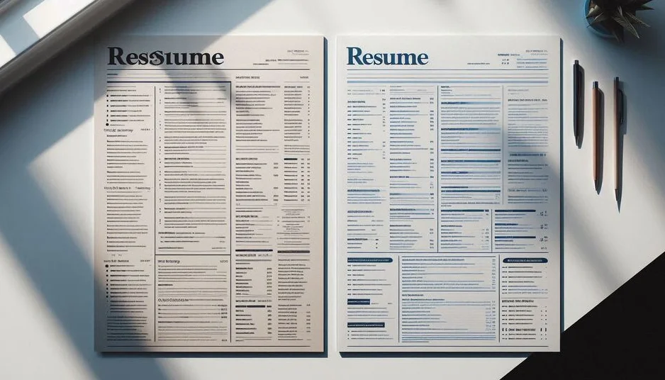
The layout and formatting of a resume play a huge role in making it easy to read. A well-structured resume that utilizes consistent spacing, margins, and alignment helps guide the reader’s eyes from section to section. By using a clear and logical structure, such as grouping similar information together (e.g., experience, education, skills), hiring managers can quickly scan the resume and locate key information. Resumes that lack these formatting cues can overwhelm the reader, making it harder to absorb important details.
Use of Headings and Subheadings
Headings and subheadings act as signposts, guiding the reader through the document and clearly marking different sections. Resumes with distinct, well-placed headings (e.g., “Work Experience,” “Skills,” “Education”) allow hiring managers to quickly jump to the section they are interested in. This helps create a visually hierarchical structure, making the resume feel organized. Additionally, clear headings help recruiters to easily skim for specific qualifications or experience relevant to the position, increasing the overall readability of the resume.
Font and Typography
Choosing the right font and typography is essential for readability. A clean, professional font such as Arial, Calibri, or Helvetica ensures that the text is legible, even at smaller sizes. The font size should also be appropriate too large and the resume may look unprofessional, too small and the content may appear cluttered and hard to read. Consistency in font style and size across the resume creates a harmonious look that helps guide the reader’s eyes naturally, without distraction.
Psychological Aspects of Readability
Readability is not just a matter of formatting and layout; it also has psychological aspects that influence how a resume is perceived. The easier it is to read a resume, the more likely the hiring manager will feel positively about the applicant. When resumes are well-organized and easy to skim, the brain perceives the content as more structured and less overwhelming, creating a sense of competence and professionalism. This is why resumes that use white space effectively, without appearing too crowded, are perceived more favorably than those that are packed with information.
Resume Clutter vs. Clean Design
A cluttered resume filled with too much text or poorly arranged sections can be visually overwhelming. Hiring managers often skim resumes quickly, and a crowded layout forces them to search for important details. In contrast, a clean and simple design helps the reader focus on what matters most. Avoiding excessive text, unnecessary embellishments, or overly complicated formatting creates a calm reading experience, which in turn makes the resume feel more approachable and easier to process. Less is often more when it comes to resume design clean lines, ample white space, and clear organization allow the content to shine.
How to Create Easy-to-Read Resumes
To make your resume as readable as possible, focus on creating a balanced and organized layout. Here are a few tips to help you design an easy-to-read resume:
- Use a simple and professional font: Stick with clean, sans-serif fonts like Arial, Helvetica, or Calibri, and ensure that the font size is large enough for easy reading (usually 10-12 pt).
- Keep your layout clear and organized: Use consistent margins, aligned text, and section breaks to create a clean and balanced layout.
- Prioritize white space: Don’t overload your resume with information. Give your content room to breathe to enhance readability.
- Utilize headings and subheadings: Clearly defined sections with bold, concise headings help guide the reader through the resume and allow them to quickly find the information they’re looking for.
- Limit bullet points: Bullet points are a great way to break up text, but avoid overcrowding. Limit the number of bullets per section to make the content more digestible.
Conclusion
In conclusion, while the content of a resume is important, how it is presented plays a huge role in its readability and overall effectiveness. Resumes that are well-organized, properly formatted, and free of unnecessary clutter are far easier to read than those that lack structure. By focusing on layout, typography, and clean design, you can ensure that your resume stands out for the right reasons and leaves a lasting positive impression on hiring managers. A resume that is easy to read and visually appealing will help you highlight your skills and experiences in the best possible light, making it more likely that you’ll land your desired job.