In today’s digital age, your resume may be viewed on a variety of devices, from large desktop screens to small mobile phones. As more recruiters and hiring managers use mobile devices to review resumes, it’s essential to design your resume in a way that ensures it looks great and functions well, no matter what device it’s being viewed on. In this post, we’ll discuss the key differences between designing resumes for large screens and mobile viewers, and provide best practices for optimizing your resume for both platforms.
Understanding the Difference Between Large Screens and Mobile Devices
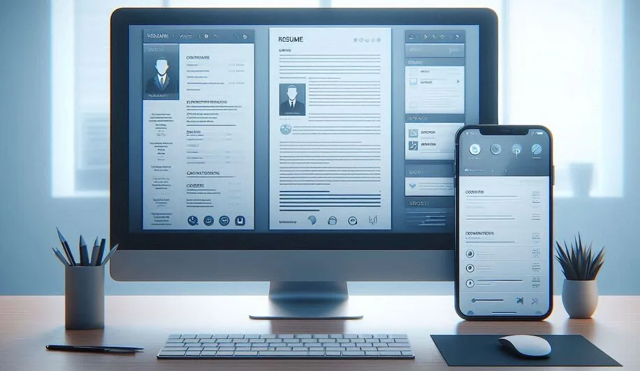
Designing resumes for large screens and mobile devices involves different considerations due to the size and layout constraints of each platform. Large screens offer more space, which allows for complex layouts, detailed formatting, and larger images. Mobile devices, on the other hand, have smaller screens and require more streamlined designs that prioritize clarity and easy navigation. Let’s take a deeper look at how each platform affects resume design.
How Large Screens Affect Resume Design
When designing a resume for a large screen, such as a desktop or laptop, you have the luxury of space. This allows you to create visually rich designs with ample whitespace, multiple columns, and larger images or graphics. While this can make your resume look more polished and professional, it also comes with the challenge of ensuring that the design doesn’t become cluttered or overwhelming. Large screens can support more detailed elements like borders, background images, or even color accents, but too many design elements can distract from the content.
How Mobile Devices Affect Resume Design
On mobile devices, the primary challenge is screen size. Mobile phones and tablets typically have smaller screens, which means that any design elements must be simple and easily readable. Mobile users often scroll through resumes rather than reading them in-depth, so the content should be digestible in small chunks. With less space, the layout must be streamlined, and unnecessary design elements like graphics or excessive whitespace should be minimized. Additionally, mobile users may view resumes in both portrait and landscape orientations, requiring flexible design techniques that adjust accordingly.
Key Design Considerations for Large Screens
When designing a resume for larger screens, the goal is to take full advantage of the available space while maintaining a professional and clean layout. Here are some key design considerations for large screens:
Layout and Spacing for Large Screens
Large screens allow for multi-column layouts, which can make your resume feel organized and dynamic. For example, you can place your contact information, skills, and education in a narrow column on the left, while dedicating the rest of the page to your experience and achievements. This creates a visually balanced layout that leverages the space without overwhelming the reader. However, it's important not to overcrowd the design. Use adequate spacing between sections, and avoid squeezing too much content into any one area. White space is essential for making your resume easy to navigate and read.
Font Size and Readability on Large Screens
On larger screens, you can use larger fonts for headings and titles to create a clear visual hierarchy. A font size of 14–16px for body text and 18–24px for section headings is typical for large-screen designs. However, it’s important to ensure that the text remains legible, and doesn't appear too large or too small in relation to the rest of the content. Test the readability at different screen resolutions to ensure your resume remains clear and well-structured.
Key Design Considerations for Mobile Devices
When optimizing your resume for mobile devices, the goal is simplicity and clarity. Here are the key design considerations for creating a resume that works well on smartphones and tablets:
Layout and Spacing for Mobile Devices
On mobile devices, it’s best to stick with a single-column layout. This eliminates the need for scrolling horizontally and ensures that content is displayed clearly without squeezing. Keep text large enough to be legible without zooming, and use simple bullet points or short paragraphs. Avoid adding too many sections or details that may force users to scroll endlessly. Proper margins and padding are important to prevent the resume from feeling cramped.
Font Size and Readability on Mobile Devices
For mobile devices, readability is paramount. Use a larger font size for body text, typically between 16–18px, to ensure it’s legible on smaller screens. Headings should be at least 20px, and spacing between lines (line height) should be generous to improve readability. Also, ensure that your resume is legible in both portrait and landscape orientations by testing it across various devices.
Designing for Responsiveness: Tips and Tricks
Responsiveness refers to designing a resume that automatically adjusts its layout depending on the device it’s being viewed on. Here are a few tips for creating a responsive resume:
- Use a responsive design framework, such as HTML and CSS, to ensure that your resume adapts to different screen sizes.
- Keep your design simple and mobile-first, focusing on key content that stands out.
- Ensure that any images or graphics scale properly on mobile devices without causing layout issues.
- Test your resume on different devices to ensure that it displays correctly on both large and small screens.
Best Practices for Creating a Multi-Platform Resume
To create a resume that looks great on both large screens and mobile devices, here are some best practices:
- Keep the layout simple and clean, using minimal design elements that enhance the content.
- Test your resume on multiple devices to ensure it’s responsive and visually appealing.
- Use legible fonts and appropriate font sizes for different screen sizes.
- Focus on content first make sure your resume communicates your skills, experience, and achievements clearly and concisely.
Conclusion
Designing a resume for both large screens and mobile viewers requires a careful balance of simplicity, readability, and adaptability. By following the best practices outlined in this post, you can create a resume that not only looks great on any device but also effectively communicates your qualifications to potential employers. Whether you’re applying for a job in a tech company or a creative agency, optimizing your resume for different platforms is an essential step in presenting yourself in the best possible light.