Why Columns Can Be Effective in Resume Design
Organizing Information Clearly
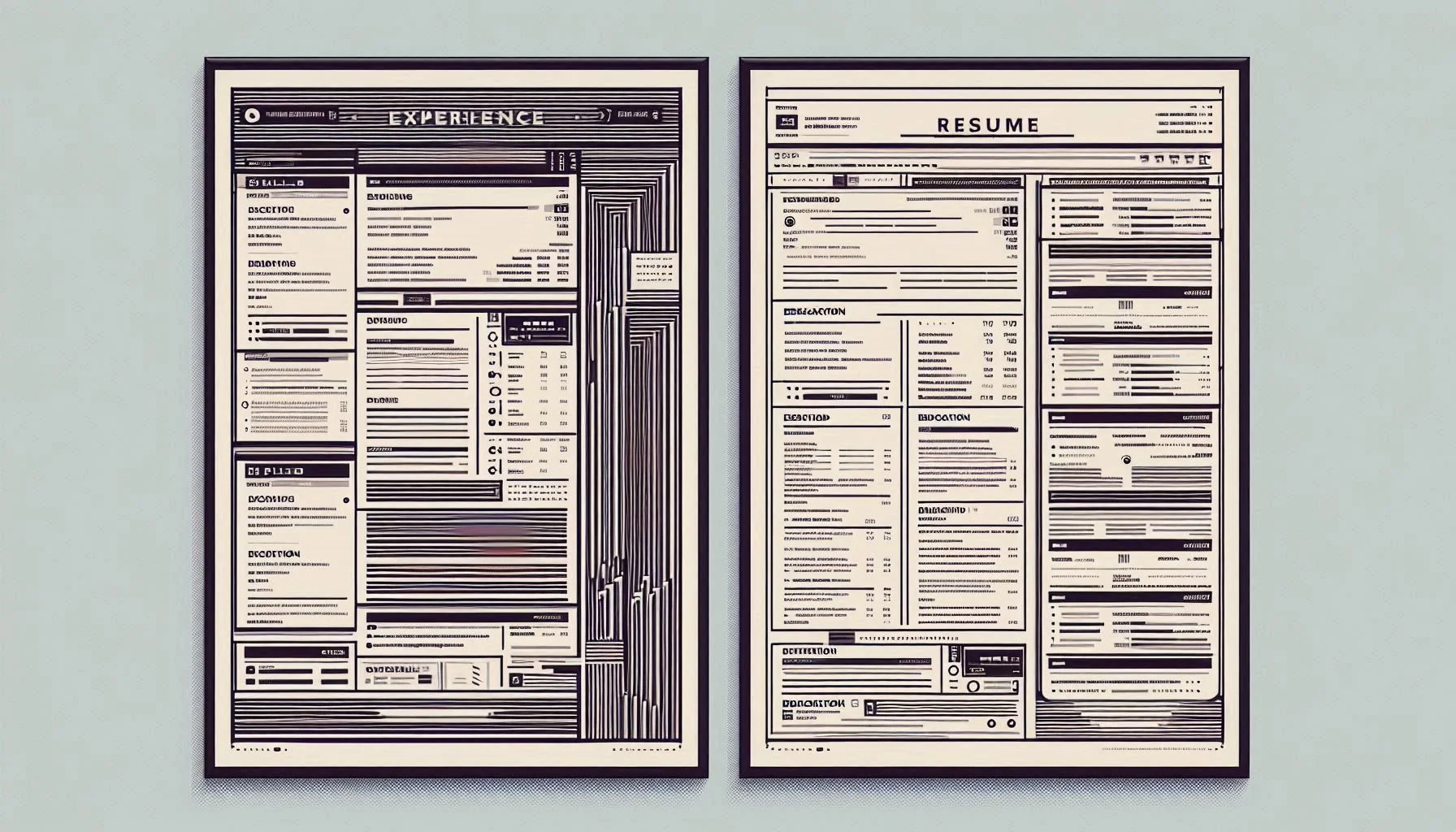
Columns can help organize large volumes of information in a more digestible format. By dividing your resume into two or three columns, you can reduce visual clutter and make it easier for the reader to find key details. For instance, placing contact information, skills, and languages in a narrow column on the left while dedicating the rest of the space to your experience and education can enhance the logical flow of the document. This type of structure allows recruiters to quickly scan for essential details without feeling overwhelmed.
Enhancing Visual Appeal
Columns also improve the aesthetic appeal of a resume. A well-designed, columnar layout can make your resume stand out in a stack of text-heavy documents. A visually appealing resume with clear sections and balanced whitespace feels professional and modern, helping you catch the attention of hiring managers. Columns add structure and clarity, making your resume more engaging and easier to navigate, which is key to leaving a lasting impression.
When to Use Columns in Resume Design
Career Change or Creative Roles
For individuals transitioning into a new career or applying for creative positions, columns can be an effective way to highlight transferable skills or showcase creative projects. A split layout allows you to clearly separate different skill sets, qualifications, and experiences that may otherwise blend together. This is particularly useful in creative fields like graphic design, marketing, or advertising, where visual appeal and innovative presentation are highly valued.
Highlighting Skills and Qualifications
If you have a diverse skill set or a combination of hard and soft skills, using columns can help highlight them clearly. A narrow column on the left can be dedicated to listing your technical skills, certifications, and language proficiencies, while the right column can showcase your work history and accomplishments. This separation ensures that your core competencies are easily identifiable and don’t get lost in a dense block of text.
Space Management and Compact Layout
For resumes with limited space, columns offer a great solution. By organizing information into two or three columns, you can make the most of the available space while still keeping the content clean and well-structured. This is particularly helpful for candidates with extensive experience or multiple certifications. A compact layout also makes your resume appear more concise, even if you have a wealth of information to include.
When to Avoid Columns in Resume Design
Readability Issues
One of the primary reasons to avoid columns in your resume design is readability. While columns can look visually appealing, they can make your resume harder to read, especially if the content is dense or the fonts are too small. Columns break up the text in ways that can confuse readers, particularly if there’s too much information crammed into a narrow space. If the content feels cramped or disjointed, it could deter recruiters from engaging with your resume. Always prioritize readability above all else.
Applicant Tracking Systems (ATS) Compatibility
Another important reason to avoid columns is their potential compatibility issues with Applicant Tracking Systems (ATS). ATS software parses resumes to extract information such as contact details, job history, and qualifications. Unfortunately, many ATS programs struggle with resumes that use columns, as the formatting can confuse the system. This means that important information, like your work experience or education, may not be accurately parsed. If you’re applying to jobs that use ATS software, it’s safer to stick to a traditional, single-column layout to ensure that your resume is properly read and evaluated.
Best Practices for Column Use in Resumes
Design Tips for Columns
If you decide to use columns, keep a few design tips in mind. Firstly, ensure that there’s enough space between columns to avoid clutter. Use consistent font sizes and avoid overloading the columns with too much information. It’s also important to keep the design clean and professional-avoid using too many colors or fancy fonts that could detract from the content itself. Finally, test your resume by viewing it in different formats (e.g., PDF, Word) to ensure the layout holds up on various devices and platforms.
Testing and Reviewing Your Resume
Before finalizing your resume, review it thoroughly to ensure that the column design works effectively. Ask yourself if the layout makes it easier to read and navigate or if it adds unnecessary complexity. It’s also a good idea to have someone else review it to get a second opinion. If possible, test your resume using an ATS tool to ensure that the content can be read correctly by any software that might be used during the hiring process.
Conclusion
Columns in resume design can be an excellent tool for organizing information and creating a visually appealing, modern resume. However, they should be used with care. Always ensure that the layout improves readability, doesn’t overwhelm the page, and is ATS-friendly. By following best practices and knowing when to use or avoid columns, you can create a resume that stands out for all the right reasons.