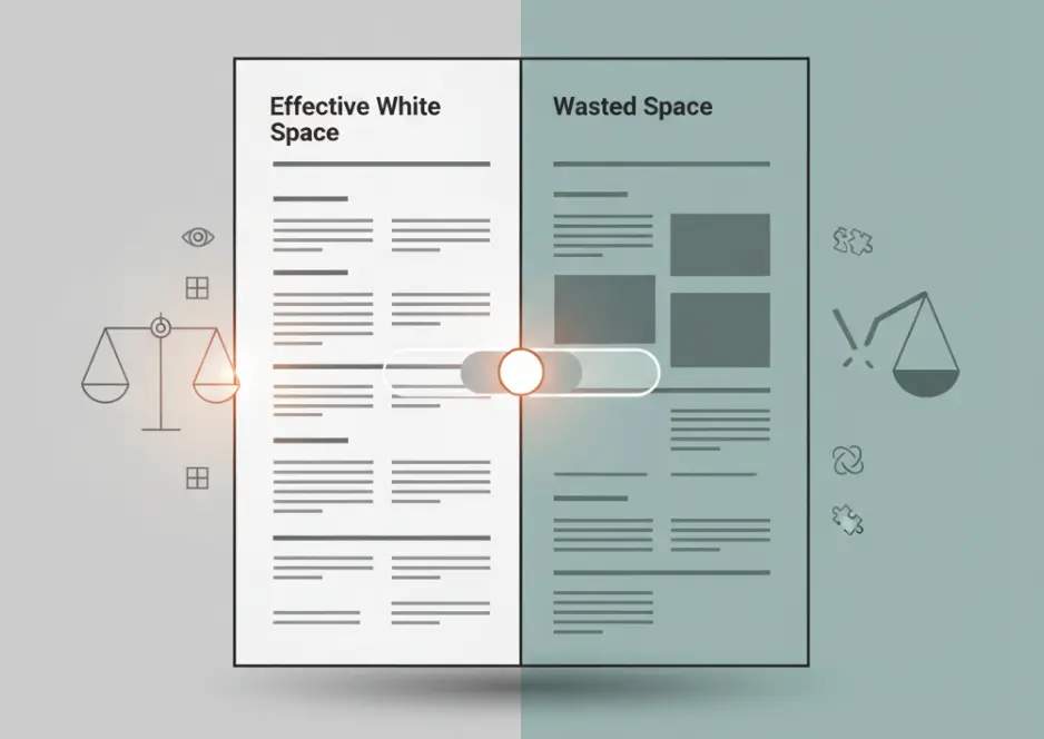
White space plays an essential role in resume design because it improves readability and helps recruiters navigate information quickly. In typography and layout design, white space refers to the empty areas between sections, paragraphs, bullet points, and margins. While it may seem like unused space, it actually serves an important purpose by preventing the page from feeling crowded or overwhelming. However there is a delicate balance between helpful white space and wasted space. When too much empty area exists without meaningful content, the resume may appear thin, incomplete, or inefficient. Understanding when white space supports clarity and when it becomes wasted space helps candidates create resumes that look both professional and information rich.
Why White Space Matters in Resume Readability
Creating Visual Balance
White space helps distribute information evenly across a resume. Instead of presenting dense blocks of text, strategic spacing separates sections and bullet points so the reader can process information more comfortably. This visual balance prevents fatigue and makes the document easier to review quickly.
Balanced spacing allows each section of the resume to stand out clearly without competing for attention.
Improving Recruiter Scanning Speed
Recruiters often review resumes within a short time frame. White space helps them identify headings, bullet points, and achievements quickly. Clear separation between sections enables the reader to scan the document efficiently and locate relevant experience without difficulty.
Proper spacing also reduces visual clutter, allowing important accomplishments to stand out more effectively.
Supporting a Professional Appearance
A well designed resume looks clean and organized. White space contributes to this professional appearance by giving the layout structure. Documents that are too dense can feel overwhelming, while balanced spacing creates a polished presentation that reflects careful preparation.
When White Space Turns Into Wasted Space
Too Little Content on the Page
White space becomes wasted when large portions of the page remain empty because the resume lacks enough meaningful information. For example a resume with minimal bullet points under each role may create large blank areas that make the document appear incomplete.
Instead of expanding spacing artificially, candidates should focus on adding relevant achievements, responsibilities, or measurable outcomes that strengthen the content.
Excessively Large Margins
Margins are necessary for readability, but overly large margins can reduce the amount of usable space on the page. When margins consume too much area, valuable room for experience and accomplishments is lost.
Standard resume margins generally fall within a moderate range that maintains readability while allowing sufficient space for content.
Oversized Line or Section Spacing
Large gaps between lines, bullet points, or sections can create unnecessary empty space. While some spacing is essential for clarity, excessive separation can make the resume feel fragmented and longer than necessary.
Moderate spacing keeps sections readable without wasting valuable page space.
Finding the Right Balance Between Density and Clarity
Prioritizing Important Content
The most effective resumes use available space to highlight meaningful achievements rather than leaving large blank areas. Candidates should prioritize accomplishments that demonstrate measurable results, leadership, or technical expertise.
When important information fills the page appropriately, white space naturally supports readability instead of appearing wasteful.
Using Structured Layouts
A structured layout helps maintain balance between text and spacing. Clear headings, bullet lists, and section dividers organize information logically. This structure allows the resume to remain visually clean while still presenting substantial content.
Well organized sections reduce the need for excessive spacing.
Applying Strategic Spacing
Strategic spacing focuses on separating major sections while keeping related information close together. For example spacing between job roles may be slightly larger than spacing between bullet points within the same role. This hierarchy helps readers understand the structure of the document.
Using spacing intentionally creates clarity without sacrificing content density.
Common White Space Mistakes in Resumes
One frequent mistake occurs when candidates increase spacing in order to extend a short resume to fill an entire page. While this may create visual balance temporarily, it often results in noticeable empty areas that suggest limited experience. Instead candidates should focus on expanding relevant achievements or skills.
Another mistake involves overly compact resumes that attempt to eliminate white space completely. Dense paragraphs and tightly packed bullet points make the document difficult to read and discourage careful review by recruiters.
Some resumes also use inconsistent spacing where certain sections appear crowded while others contain large empty areas. Consistency in spacing improves both readability and visual professionalism.
Conclusion
White space is an essential design element that enhances readability and helps recruiters navigate a resume quickly. However it becomes wasted space when excessive margins, oversized spacing, or limited content leave large portions of the page empty. The goal is to achieve a balanced layout that combines clear structure with meaningful information. By prioritizing strong achievements and applying spacing strategically, candidates can create resumes that feel both clean and content rich. Proper balance ensures that white space supports clarity rather than reducing the impact of the document.